Are your stakeholders actually using the BI reports you build for them to make business decisions?
The Problem with Traditional BI
As technical professionals, we invest considerable time engineering robust reporting dashboards. We naturally assume these tools become the backbone of our stakeholders' decision-making process.
However, through qualitative case studies and interviews across corporate environments, we uncovered a shockingly low adoption rate. Less than 20% of enterprise users rely on existing BI reports as their primary source of information. Instead, users inevitably fall back to manual Excel spreadsheets and fragmented updates from colleagues—even when the exact data they need is readily available in their BI suite.
Based on our research, effective business reporting must solve for two variables:
- Accessibility: Friction kills adoption. If users have to authenticate into a desktop application (Tableau, Qlik, PowerBI), wait for a web portal to load, or download large attachments, usage rates plummet. The most effective delivery mechanism remains the inbox. Reports must be rendered instantly as inline images (via CID embedding) the moment an email is opened.
- Simplicity: Dashboards must deliver immediate, relevant insights. Extraneous data, complex interactive widgets, and multi-layered filters create cognitive overload. Providing too much information frustrates business users and actively discourages engagement.
Our Solution: Seamless Exporting
To solve this adoption crisis, Lineverge engineered a native report exporting feature, fully integrated into Automail starting from version 3.7.
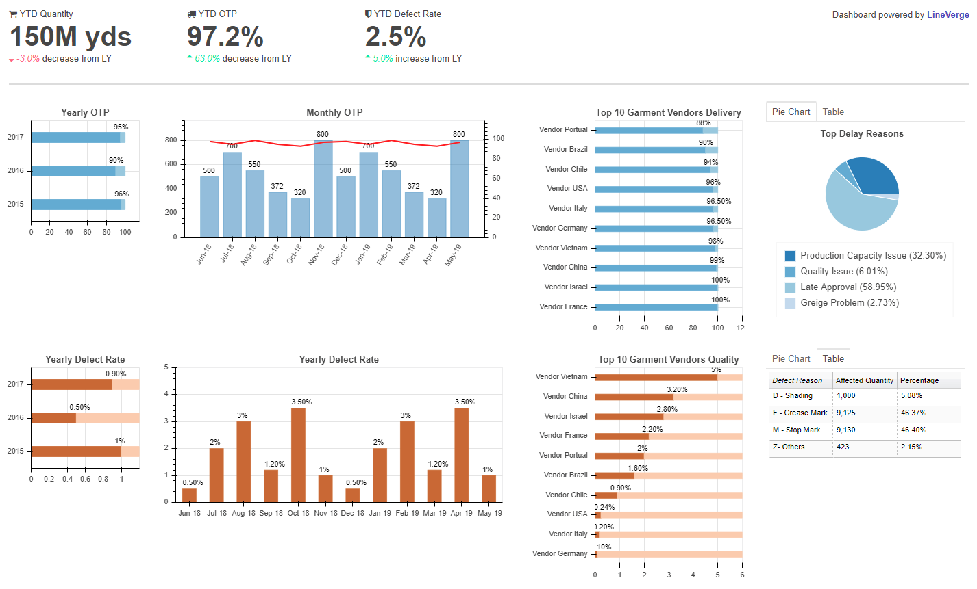
This feature acts as an abstraction layer over Bokeh—a powerful, open-source Python visualization library—and supports automated, high-fidelity PNG exports. Report components (charts, tables, KPIs) are structurally defined via a JSON-like dictionary. This architecture empowers our engineers to rapidly iterate on content and formatting with business stakeholders without touching core logic.
Once approved, Automail autonomously renders and dispatches these reports via email on highly customized schedules.
Why this architecture works:
- Zero Infrastructure Dependency: Users do not need specialized BI software, VPNs, or even a fast internet connection to review critical metrics.
- Hyper-Targeted Insights: Content and formatting are ruthlessly edited to serve the precise needs of the recipient.
- Verifiable Engagement: Our data scientists can definitively monitor usage rates through email open activity, allowing us to pivot quickly if a report underperforms.